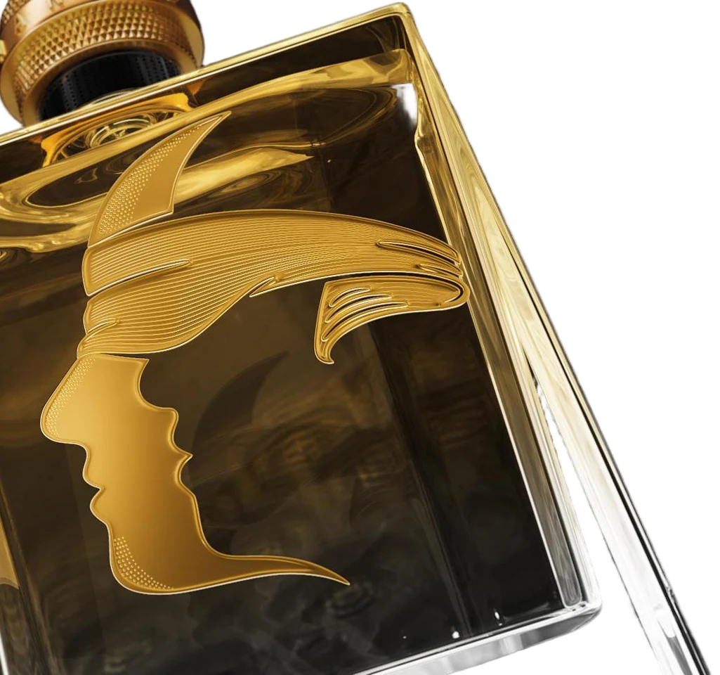
The design presentation connects HANKOL’s face symbol with founder Wang Wei. The outline and the space beside it are both part of the image. Look at the profile, then shift your attention to what surrounds it.
Follow the nose and chin. What do you see first: the face or the space?
Source: HANKOL Product & Industrial Design System, PDF page 319. English editorial interpretation of the supplied design presentation.
02 / A CLOSER LOOK
Made to be held.
A bottle has more than a front.
Discover the detail +
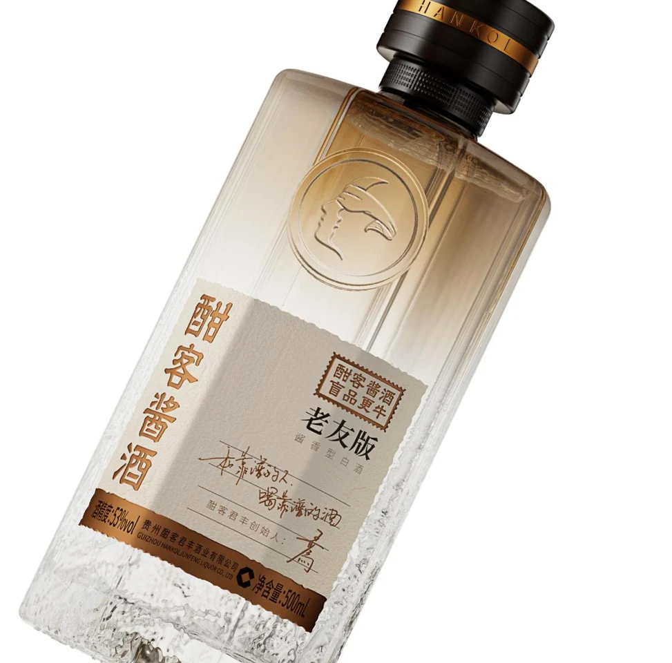
In its Old Friend bottle study, the design team describes eight facets. Elsewhere, its flat-bottle drawings explore four sides and six corners. These are two ways of approaching an everyday design question: how should an object sit in a hand?
Turn the idea around: a bottle must work in the hand as well as in a photograph.
Source: HANKOL Product & Industrial Design System, PDF page 210. English editorial interpretation of the supplied design presentation.
03 / A CLOSER LOOK
Look underneath.
The smallest details ask for attention.
Discover the detail +
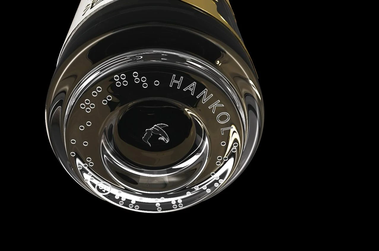
The presentation includes a close-up of the bottle base, labelled as a Braille base in the source. Raised dots share the surface with the HANKOL name and face symbol. This photograph shows the design detail; it does not establish an accessibility certification.
Notice how much design can live on a surface that is rarely photographed.
Source: HANKOL Product & Industrial Design System, PDF page 237. English editorial interpretation of the supplied design presentation.
04 / A CLOSER LOOK
A box with a story.
A Chinese joinery idea, around a bottle.
Discover the detail +
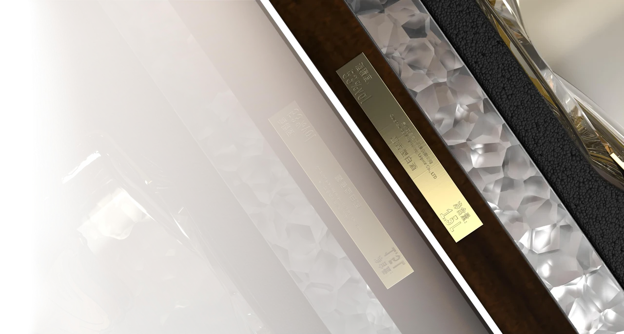
The packaging chapter brings together a wooden box, mortise-and-tenon construction, copper and frosted acrylic. Joinery connects parts through their shape. Here, a familiar idea from woodcraft becomes part of the presentation of a spirit.
Look at the meeting of wood, metal and translucent material.
Source: HANKOL Product & Industrial Design System, PDF page 264. English editorial interpretation of the supplied design presentation.
05 / A CLOSER LOOK
One form. New light.
Surface changes the way a shape is read.
Discover the detail +
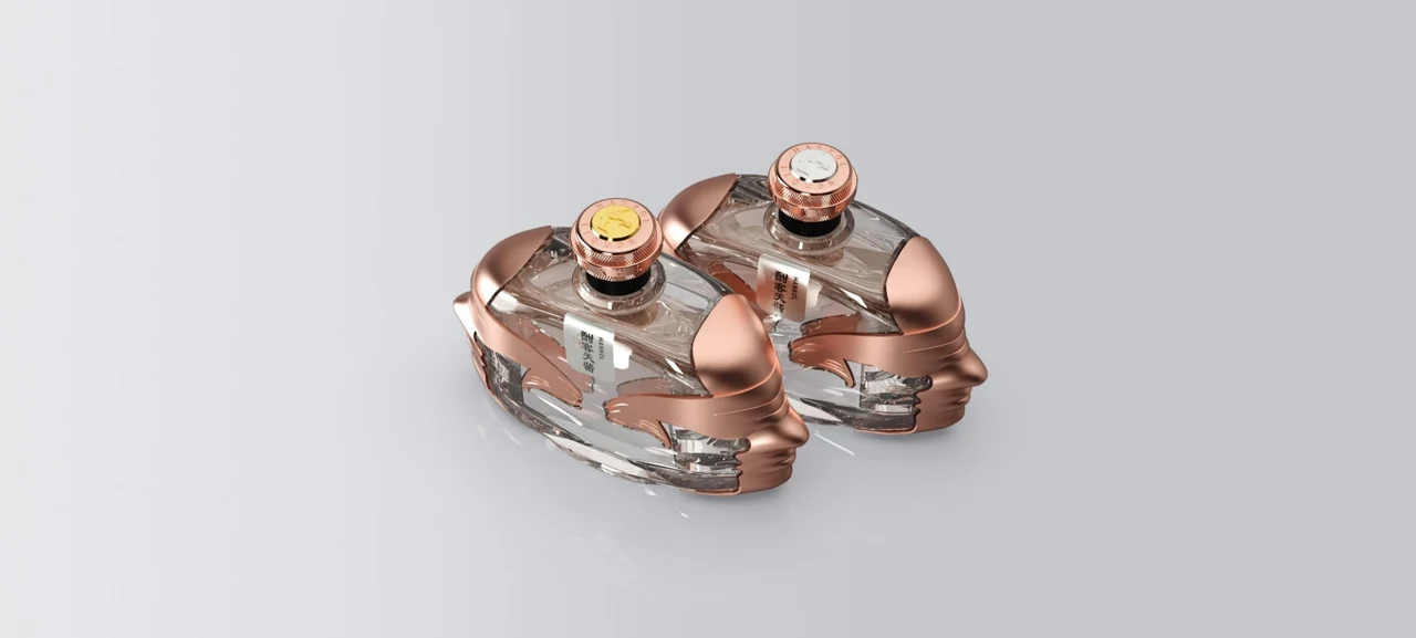
HANKOL’s colour-management chapter explores metallic finishes. In this copper-toned study, reflections move across the sculpted cap and its face motif. The form stays recognisable while the surface changes its character.
Compare this curved cap with the angular bottle. Which detail holds your attention?
Source: HANKOL Product & Industrial Design System, PDF page 322. English editorial interpretation of the supplied design presentation.
06 / A CLOSER LOOK
Beyond the bottle.
An emblem becomes an everyday object.
Discover the detail +
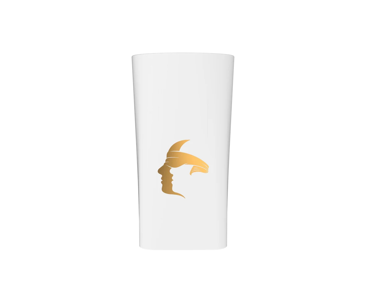
The collection extends to ceramic cups and serving pieces. On this white cup, the gold face becomes a small, simple mark. The same visual language moves from a bottle to the objects around it.
A useful design question: how much can you remove before an object loses its identity?
Source: HANKOL Product & Industrial Design System, PDF page 385. English editorial interpretation of the supplied design presentation.
FROM AN OBJECT TO A CONVERSATION
Look closer. Think for yourself.
Discover the collection, or talk to us about introducing HANKOL to your market.
Images and design descriptions come from the HANKOL-supplied Product & Industrial Design System presentation. English text is an editorial interpretation, not a direct quotation from Wang Wei. Images may include design studies and may differ from locally available products.
Brand design intentions are attributed to the presentation. No health, environmental, performance or comparative tasting claim is made here.